Wednesday 31 August 2022


Rachel Gracey, 'River Notes,' at the Zuleika Gallery, Woodstock, Oxfordshire, from 3 September 2022.

Rachel Gracey takes the title for her latest exhibition from what she calls ‘a quite extraordinary, quirky book’ that was first published in 1979, and which she happened upon quite by chance. River Notes: The Dance of Herons, by the American author Barry Lopez, lyrically charts the inner life of a nameless narrator, and his thoughts and feelings in an unnamed landscape – looking, watching, dreaming – alert to all the sensations of Nature. Gracey was particularly captured by one of the final lines, when, with winter approaching, a dried-out watercourse returns after a long summer drought. ‘The river has come back to fit between its banks,’ Lopez’s narrator observes. ‘To stick your hands into the river is to feel the cords that bind the earth together in one piece.’ 


Lopez’s word ‘cords’ echoes with its musical homophone, ‘chords,’ and the ‘notes’ of his title are not simply the record of his words, but also his appreciation of nature’s sounds. The book’s whole approach to being with and in the natural world resonated with Gracey, who also has a deep appreciation of music. ‘This is what I am really doing,’ she realized as she read. ‘I’m observing what’s going on ... I’m involved in watching landscape, watching nature.’ 

The first set in her quartet of prints was inspired by the River Thames at Port Meadow. This large, open area of flood plain on the western edge of Oxford has for centuries been an area of common land, open to everyone. During the isolation of lockdown in 2020 it also became a popular location for escape from confinement. Gracey saw how important water suddenly was for so many people – as a place of sanctuary, release, freedom. Reflecting the changing moods of that difficult year, these smaller images (necessitated by her inability at the time to source the larger zinc plates she usually works from) are often liberating and celebratory. A few are also sad, sullen, dark. 

The second set, inspired by the River Helford in Cornwall, reflects a very different sort of river, one that is dramatic and powerful. They sing with a different, wilder sort of rhythm. The Cherwell, the river closest to her home in North Oxford, and its neighbouring ponds, inspired the gentler third set. The Cherwell has many busy stretches – especially in summer, when it is the haunt of walkers, anglers, bathers, canoeists and punters. But it can quickly quieten. When it does, one can sometimes spot a kingfisher, an egret, cormorants, a heron, or wagtails. These ornithological elements are in the images she creates, the colours and the shapes bringing out perhaps the fluttering of birds, or their song. 


Poised on the riverbank, carefully observing, Gracey makes records on paper in ink and pencil and watercolour, producing endless drawings for each set of prints in her series. Having collected her information, her sketches are taken back to the studio, where they eventually became the inspiration for her finished works. 

What is most striking in them is Gracey’s powerful and assured use of colour. ‘Nature does have such vibrancy,’ she explains. ‘Sometimes you wouldn’t believe it – sometimes it’s only there in the leaf, but I think, “Let’s actually make it the whole thing!”’ She is very keen to push the boundaries of printmaking, and sculpture has been a particular influence. One of her favourite artists is the American sculptor Alexander Calder (1898–1976). Best known for the metal mobiles he started making in the early 1930s, Calder brought colour and movement to what until then had been a very static, frequently monochrome medium. 

Gracey perceives how movement is happening all the time, even in the stillest English landscape. With her most recent prints she has aimed to capture something of this shifting three-dimensionality. Her aim in every work is to capture something of the motion and the depth in a single moment – to capture what she calls ‘one essence of a place.’ Made during the spring, summer and autumn 2021, the Cherwell series have an extraordinary vibrancy and joy to them. ‘With these,’ she says, ‘I think the river has been so full of surprises ... They are much stronger than I thought they were going to be.’ 


The final set, based upon a brief visit to the River Stour in Dorset earlier this year, is the most deeply personal. Gracey has bound some into a little book she titles ‘Rubato Flow.’ A musical term, rubato refers to a composer’s permission to free the performer, allowing them to express their own interpretation, making its rhythm their own. Using just black and white on coloured paper, they are a meditation on the recent death of her father, conveying how, even in the latter stages of his life, he expressed a joy and freedom in living – a desire always to seize life. Though sad and poignant, this final set is, nonetheless, meditative and beautiful. 

Fittingly, here Gracey quotes melodic lines from Maya Angelou’s poem, On the Pulse of Morning: ‘A river sings a beautiful song. It says / Come, rest here by my side.’

Sunday 21 August 2022

Cutting it Fine: The Art of the British Wood Engraver 

This is the text for a short guide I wrote for the exhibition I curated at Salisbury Museum in Wiltshire, which took place from 16 October 2021 – 16 January 2022, and which also included an exhibition of work by the wood engraver Howard Phipps. It was featured on BBC Radio 4's arts programme, 'Front Row,' on 16 December 2021


                                                                    Gwen Raverat, Poplars in France (1914), private collection


The technology of printing onto paper from wooden blocks goes back many centuries: its earliest origins have been dated to Ancient China in the first centuries AD. Both printing and paper-making technology arrived in Europe from China some time in the thirteenth-century, with Johannes Gutenberg going on to invent his famous printing press using moveable metal type in 1439. This heralded a printing revolution that helped change the world. 

The illustrations that appeared in many of the first European printed books were made using wooden blocks fashioned with traditional wood working instruments such as knives, gouges and chisels. These cut an image along the grain of the wood (like working into the soft face of a plank, rather than the much harder end grain). Though usually intended to accompany a piece of text, these woodcut images could nonetheless became highly desirable items in their own right. In the hands of a master-practitioner such at the German artist Albrecht Dürer, who worked in the late fifteenth and early sixteenth century, incredible detail could be achieved. The technique became hugely popular for producing mass-produced images through to the early modern period, when it was largely replaced by engraving onto metal plates (principally copper). 

But a woodcut is not quite the same thing as a wood engraving. 

Thomas Bewick 

A wood engraving differs from a woodcut in that the image is cut along the end grain of the wood block, using fine metal engraving tools, such as a burin or graver, originally intended to engrave copper plates. The perfection of this seemingly simple innovation (which made for longer-lasting blocks with much finer detail and expression) is generally credited to the English craftsman and naturalist, Thomas Bewick (1753 –1828). 


                              Thomas Bewick, The Chillingham Bull (1789), private collection

Bewick was born into a Northumberland farming and mining family who lived in the village of Mickley, a dozen miles or so west along the River Tyne from Newcastle. Bewick’s childhood home, Cherryburn House, still stands, and is now owned by the National Trust. In 1767 the teenage Bewick was apprenticed to a jewellery, enamelling and engraving business in Newcastle. It was there that he began engraving on wood, developing the techniques and style for which he would become famous. His illustrated books, Aesop’s Fables, A General History of Quadrupeds and A History of British Birds, enjoyed remarkable popularity and renown in the nineteenth century, both in Britain and abroad. 


White Line Engraving 


Traditionally, woodcut designers had carved their wooden printing block to create lines emulating those made in a pen drawing. Think of cutting two parallel grooves into a square piece of wood: when printed, this will create a black line between two white lines in a black background. This is known as black-line engraving, and it mirrors the effect achieved by copper plate engraving. (When printing from a copper plate, the cut line is filled with ink, and when run through a heavy press the line prints black. In a woodblock print, however, the cut line is not exposed to ink, and it thus prints white.) 

Bewick reconceptualized printing from wooden blocks by focusing his designs on the white lines that he cut away from the block with his tools. His method is known as white-line engraving. (This can seem a little confusing at first, for conceptually it is a little tricky to get one’s head around the difference.) Bewick’s method allowed him to use his tools with a much greater degree of flexibility and freedom of expression, and to achieve far greater variation of tone. More subtle effects could also be gained by combining both techniques. 

Through the course of the nineteenth century, wood engraving became hugely popular worldwide as a method of mass-producing cheap images. However, whilst Bewick had drawn, cut and printed his own works himself, wood engraving became an increasingly industrialised process, with each stage carried out by a different operative. The intimate relationship between artist and end product was lost. 


Revival 


In 1821 another English artist-engraver, William Blake, produced a remarkable series of white-line wood engravings as illustrations for an edition of Virgil’s Eclogues. Blake’s young friend, the painter Samuel Palmer, would famously describe them as ‘visions of little dells and nooks and corners of Paradise: models of the exquisitest pitch on intense poetry.’ They rather overlooked at the time, would later prove hugely influential on a generation of twentieth-century British artists. 

It was not, however, until the 1890s that a coterie of British artists, Charles Ricketts, Charles Shannon and Lucien Pissarro, re-established the link between artist and medium. Thomas Sturge Moore, Edward Gordon Craig followed their lead into the early twentieth century, and in 1905 the artist Noel Rooke began teaching what would eventually prove to be an influential course in wood engraving and book illustration at the Central School of Arts and Crafts in London (now part of Central Saint Martins College of Arts and Design). In a 1925 lecture, Rooke would advise that there was ‘only one way of getting a thoroughly satisfactory engraving: the designer and the engraver must be one and the same person.’ 

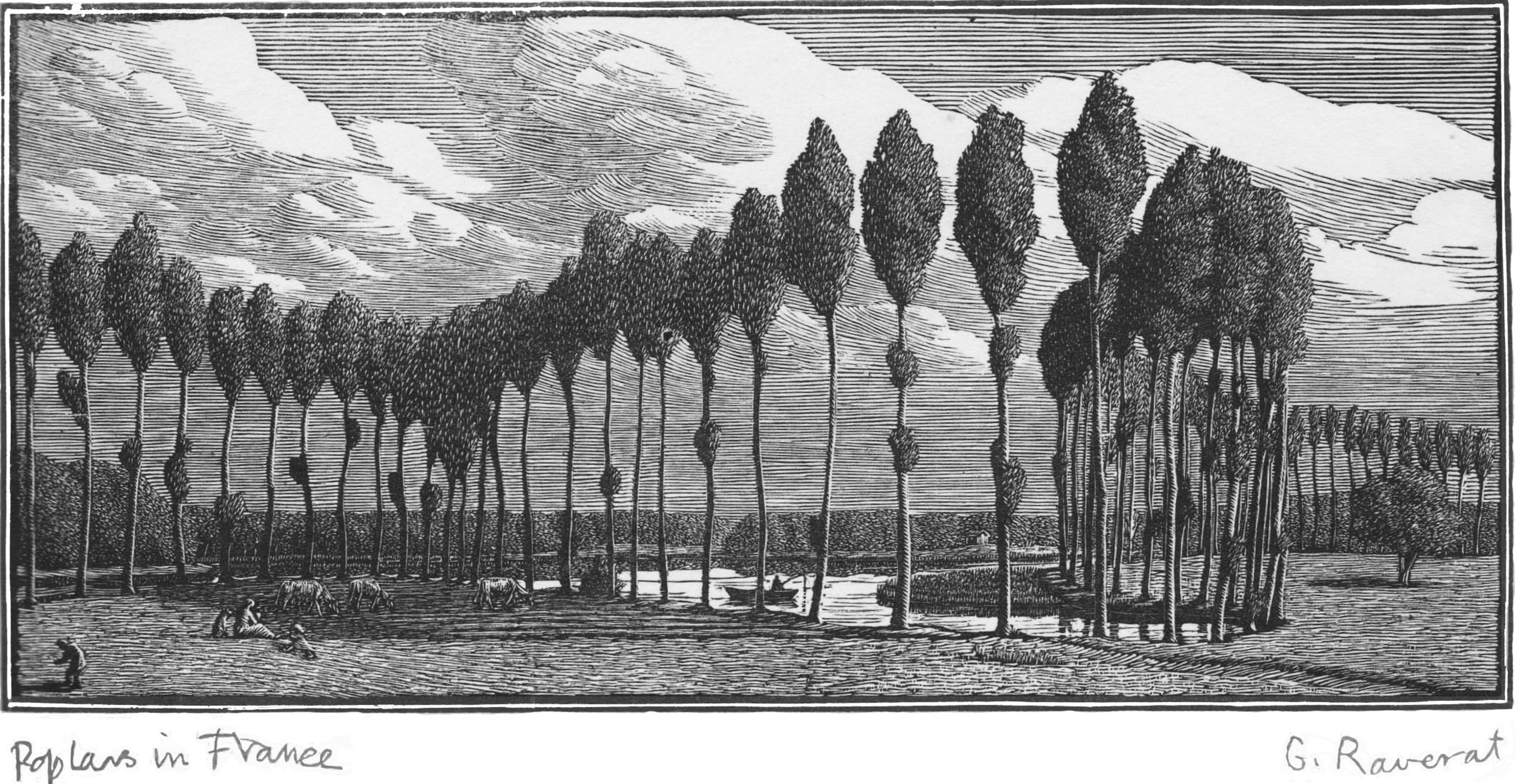
An important early figure in the new generation of modern wood engravers was Gwen Raverat (1885–1957). A granddaughter of Charles Darwin, she had first seen and admired Bewick’s wood engravings as a teenager. In 1908 she went to study at the Slade School of Art in London, where her contemporaries included Stanley Spencer (who became a close friend) and Paul Nash (1889–1946). Though it might not seem a technique particularly suited to daring young advocates of the machine age, Modernist artists soon put wood engraving to startling effect. In 1914 and 1915 two Slade graduates, the Vorticists Edward Wadsworth and Percy Wyndham Lewis, printed powerful wood engravings in both editions of the avant-garde journal, BLAST

The growing interest in wood engraving led a group of British artists, including Lucien Pissarro, Edward Gordon Craig, Robert Gibbings, Gwen Raverat and John Nash (1893–1977), to found the Society of Wood Engravers in 1920. Their annual exhibitions attracted contributions from other important British artists. They included John’s brother Paul, whose modernist artistic sympathies lay with the Vorticists, and the more traditionally minded Clare Leighton (1898–1989), a recent graduate from the Slade. 

                                                                    Paul Nash, Black Poplar Pond (1922), private collection


In the years immediately after the First World War two new art schools were established where the study of wood engraving was promoted alongside other classes and courses. In 1921 Leon Underwood (1890–1975) founded the Brook Green School of Art in Hammersmith, south-west London. Though his most famous pupils would prove to be the sculptors Henry Moore and Barbara Hepworth, his printmaking students included Gertrude Hermes (1901–1983) and Agnes Miller Parker (1895–1980). Both would become leading practitioners of the art form. Then in 1925 Iain Macnab (1890–1967) established the Grosvenor School of Modern Art at his home in Warwick Square, Pimlico, south London. Best known today for its coloured linocuts – especially those by Claude Flight, Sybil Andrews and Cyril Power – it was also an important centre for teaching wood engraving. Macnab’s students included Tom Chadwick (1915–1942) and Rachel Reckitt (1908-1995). 

It was Paul Nash who encouraged one of his hugely talented design pupils at the Royal College of Art, Eric Ravilious (1903–1942), to exhibit with (and eventually join) the Society of Wood Engravers. Though best known today for his beautiful watercolours of the English countryside and the ships and planes of the Second World War, Ravilious started his career as an engraver and muralist. Through the 1920s and 1930s he made numerous highly accomplished and assured white-line wood engravings, and was another leading practitioner, as well as something of an experimenter. His friend Edward Bawden would recall how Ravilious ‘never made the slightest mistake or showed the faintest indecision. His cutting was superb.’ Ravilious would in his turn teach the art to others, and his own pupils at the Royal College of Art would include the painter and wood engraver John O’Connor (1913–2004). 

The various small private printers and publishers that thrived in this period – the Curwen Press, the Gregynog Press, the Golden Cockerel Press and the Nonesuch Press, among others – commissioned numerous artists to design illustrations for their sumptuously decorated books. As well as the artists whose work is included in this exhibition (which hardly aims to be definitive), there were numerous other important twentieth-century British wood engravers. They include Mabel Annesley, Robert Gibbings, Eric Gill, Blair Hughes-Stanton, David Jones and Reynolds Stone, among others. 
 
When Gibbings took over the Golden Cockerel Press in 1924 he noted that wood engravings were not to be considered as ends in themselves, but as the accompaniments to text. For Gibbings, and others, the relationship between word and image was integral and indelible, as it had been for Thomas Bewick. But wood engravings were not only to be seen in specialist, limited edition works: popular books were often illustrated in this way, too. John Farleigh (1900–1965), for example, designed wood engravings for George Bernard Shaw’s allegorical tale, The Adventures of the Black Girl in her Search for God (published by Constable of London in 1932), whilst Clifford Webb (1894–1972) is perhaps best known for his illustrations for Arthur Ransome’s children’s book, Swallows and Amazons (published by Jonathan Cape in 1931). 

There was a reaction, however, against the notion that wood engravings should always be embellishments to text. In 1925 Leon Underwood left the Society of Wood Engravers to establish the short-lived English Wood Engraving Society. Its member included Gertrude Hermes, as well as the future surrealist painter, Eileen Agar. It sought to promote wood engravings as a medium that could exist independently from any purely illustrative function. Though the Society folded in 1931, with some members rejoining the SWE, as this exhibition shows wood engravings can work equally well both as illustration and as stand alone works of art in their own right. 

The Wall Street Crash of 1929 – and the Great Depression that followed – curtailed the activity of many of the specialist presses. In 1938 Underwood’s Brook Green School closed, followed by the Grosvenor School of Modern Art in 1940. The Second World War – in which Eric Ravilious would be killed whilst serving as an official war artist with the RAF, and Tom Chadwick at the battle of El Alamein – proved the final nail in the coffin. Though important wood engravers, including Underwood, Hermes, Miller Parker, John Nash and O’Connor, continued to produce significant work long after the war was won, this second golden age of wood engraving effectively came to an end. 


A New Era 


Though George Mackley (1900–1983) published his important guide book, Wood Engraving, in 1948, the technique went into steady decline after the Second World War. A key new talent, however, was Monica Poole (1921–2003), who between 1945 and 1949 was taught by John Farleigh at the Central School of Arts and Crafts. Poole drew inspiration from the Neo-Romantic movement that flourished in the 1940s. Artists such as Graham Sutherland (who had started his own career as a metal engraver before turning to painting) had drawn inspiration from the wood engravings of William Blake and Samuel Palmer’s visionary period painting in Shoreham, Kent, in the 1820s and early 1830s. But as Poole’s obituary in The Guardian observed, ‘this phase of British art was short lived and, as the subject matter of Poole’s work went out of fashion, interest in her preferred medium of wood engraving, by the 1950s, was nearly extinct.’ By that date, there was only one firm in the UK still manufacturing the highly polished blocks of boxwood the engraver depended on. 

By the 1960s even the Society of Wood Engravers had gone into abeyance. Artists and the public seemed much more excited by the modern world. Pop Art and Abstract Expressionism had little time for something as seemingly old fashioned as wood engraving. But the love of nature, landscape, history – subjects for which wood engraving seems so ideally suited – will not go away. In 1984 there was sufficient revival of interest for the artist Hilary Paynter to revive the SWE. Monica Poole became one of a number of stalwart members showing in the revived annual exhibitions. Of course, not all British wood engravers joined the Society – some highly accomplished artists nurtured their independence. But its growing success reveals the firm re-establishment of wood engraving as a much loved and popular medium through the late twentieth century and into the new millennium. 

As the examples of work by contemporary wood engravers such as Anne Desmet, RA, Paul Kershaw, Colin See-Paynton and George Tute reveal, it remains possible to find new approaches, with each artist expressing their own interests and individuality. Some like Neil Bousefield are making an exciting addition of colour into their work. Furthermore, specialist publishers such as the Fleece Press have re-emerged, producing carefully crafted books dedicated to the art of wood engraving. And only last year, the Bodleian Library produced a beautiful new edition of Aesop’s Fables with original illustrations by Agnes Miller Parker. Almost two centuries after Thomas Bewick’s death, wood engraving remains a treasured and affordable art form, yet still one that he would still instantly recognise. 


Further Reading 


Thomas Balston, English Wood-Engraving, 1900-1950 (Dover Publications, 2016) 
 
Simon Brett, Wood Engraving: How to Do It (Herbert Press, 2018) 

Anne Desmet, Scene Through Wood: A Century of Modern Wood Engraving (The Ashmolean Museum, 2020) 

Andy Friend, John Nash: The Landscape of Love and Solace (Thames & Hudson, 2020) 

Andy Friend, Ravilious & Co. (Thames & Hudson, 2017) 

Anne Hayward, Wood Engraving and Linocutting (The Crowood Press, 2008) 

Clare Leighton, Four Hedges (Little Toller Books, 2010) 

George Mackley, Wood Engraving (National Magazine Company, 1948) 

Jenny Uglow, Nature's Engraver: A Life of Thomas Bewick (Faber & Faber 2007)

Wednesday 30 September 2020

Maxwell Doig at Messum's St James's, Mayfair, London


It’s always interesting to watch the way an artist develops and grows. And it’s especially interesting seeing one who was once so preoccupied with the human form that as a student he studied human anatomy move away from painting figures to painting buildings instead. True, his central concern with the figure had always been the architecture of its form, with all its various positions and angles, rather than with the individual personality of the model (he was certainly never a portraitist). Yet in a way Maxwell Doig is still painting figures: in his attention to their character and individual detail, his buildings and boats and abandoned objects seem almost like individuals, in the same way Paul Nash once described trees as being like people to him, each with their own particular personality.


Maxwell Doig, Moorland Gable End (acrylic on canvas, 660 x 860 mm) 


            Perhaps, then, painting people was Doig’s route to now painting the buildings he records in his distinctive, inimitable manner. Certainly he himself feels that he has brought the awareness of balance and poise gained from his early anatomical studies whilst a post-graduate student at the Slade School of Art into these new works that have preoccupied him for the last six years. Indeed, as good as his paintings of people were, in buildings he has perhaps found his true subject. As he acknowledges, he has always had a fascination with them, and he is only surprised that he didn’t start painting them sooner. It wasn’t until he was approaching his fifties that he first saw them as an appropriate subject for his art. With the growing feeling that he had taken the figure as far as he could, he was gradually losing interest in painting people. It was then that he was struck by the idea of painting buildings instead. 

            He had always been interested in the shape of a suddenly glimpsed gable end, or the decayed surface and texture of the derelict factories that surrounded him in the town where he grew up and still lives – Huddersfield, in West Yorkshire. The turning point came in 2014, however, with a derelict house not far from home that particularly interested him. ‘The building itself I had always liked and photographed for years,’ he remarks. ‘The transition moment happened in the studio, when I realised I could use the surfaces and textures I normally used in the background for figures, as the central subject.’ This building became the large painting Gable End– the first of a series of studies of one side of this house viewed at different times of day and in subtly different lights. ‘It was,’ he acknowledges, ‘a turning point for me.’ And it all came so easily. When he started painting buildings he found it all perfectly natural – like he had always been doing it. So much so that it surprised him that he hadn’t started doing it much earlier.

            They were and still are often the sort of places passersby simply overlook. One of the wonders of this part of Yorkshire is the sudden transition from urban to rural: the industrial revolution kicked off around here partly because of the easy access to water power, and large buildings can be stumbled upon in unexpected locations. ‘They’re so big many people just seem to overlook them,’ Doig remarks of the old mills that dot the landscape. ‘With the exception of Peter Brook in the 1950s and ‘60s, nobody paints them.’ One that features strongly in this exhibition is Lord’s Mill, a Grade II listed building in the village of Honley, not fat from Huddersfield. Built in the early 1790s and subsequently expanded, it was in use until at least the 1950s, when its roof was destroyed by fire. It is now abandoned – boarded up and graffitied. ‘It’s like I’m the only person who’s really looked at it,’ he observes. ‘It’s nearly as old as America – it’s amazing! But it just goes unnoticed – the location’s fantastic, in a wooded valley, really romantic. It’s like a Bruegel, or one of those early painters from Ghent – valley, wood, river, rolling hillsides.’ 

            Certainly when seen like this they are the Modern Romantic’s equivalent of Tintern Abbey, the Welsh monastic ruins captured so famously by J.M.W. Turner in the 1790s, just when buildings like Lord’s Mill were going up (built, like Tintern, on the wealth generated by wool). And when seen up close there’s plenty there too to attract the attention of the discerning artist: old roof lines, patches of plaster, mould and decay, the sandstone of the region carrying its age interestingly, telling the stories of these places, their history, the records of past industry and past lives. These stones certainly speak. 


Maxwell Doig, Lord's Mill with Fence in Snow (acrylic on canvas, 1020 x 750 mm)


            Doig makes a great deal of the sudden juxtaposition – so frequent in this part of Yorkshire – between the urban and the rural. Seeing his work as ‘essentially romantic’, he does not look at these buildings or the detritus of heavy industry as an intrusion upon the landscape, but rather as partners and compliments to it. The Colne Valley was another of West Yorkshire’s centre of industrial activity. But as Doig remarks of the scrapheap he discovered there that is also the subject of a number of paintings and prints in this show, ‘it fits really nicely with the landscape – big chunks of heavy machinery, the abstract, geometric shapes.’ The same is true of the boats he saw on the Isles of Arran and Mull during a trip to Western Scotland in 2019: they fit neatly in to their similarly rugged landscape, one that has been the place of human habitation and activity for centuries. They are like the past life of the mills and the scrapheaps after snow – a jigsaw of pattern that reflects poignantly on former glories.

            His feeling that he was doing something worthwhile in this new direction was confirmed a few years ago when Doig discovered what he calls ‘the subtle, quiet’ work of the English painter Algernon Newton (1880–1968). To my mind, Newton was one of the finest RA’s of the twentieth century, his oddly brooding and slightly surreal paintings of urban canals, suburban houses and bare English countryside not having quite the attention they deserve – though he is highly collectable. ‘There's a particular stillness and quality of light which resonates with me in both his landscapes and architectural works,’ Doig explains.


Maxwell Doing, Pennine Hillside with Church Spire (monoprint, 380 x 290 mm))


            One noticeable development in Doig’s work since his previous exhibition at Messum’s in 2018 is his widening viewpoint. These recent paintings often incorporate more of the landscape, as the artist has stepped back from buildings that previously almost completely filled the frame and in which the heavily textured surface of stone and plaster could be read almost as landscapes in themselves. This widening of view in part reflects his increasing confidence and ever growing technical ability as an artist. But he has also become even more interested in atmosphere, ‘in doing more with light and mood – pushing it all a bit further,’ as he says. This concern with varying and changing impressions and effects of light and ambiance is seen most clearly in the series of paintings of the early nineteenth-century lighthouse at Flamborough Head, not far from Bridlington, on the North Yorkshire coast. This is a place he has known since first making holiday visits there as a child, and his new works advance on the paintings of the same building exhibited in 2018. As the artist explains, 


I wanted to explore it further by painting it at different times of the day and with different weather conditions. For example, Early Morning at Flamborough Head Lighthouse(dark blue sky, bright white lighthouse) is a view from the east at 6 am, summertime. Sea Fret at Flamborough Head Lighthouse(pale, misty image of lighthouse) was painted in winter, whilst Late Afternoon at Flamborough Head Lighthousewas painted in spring ... I love to paint white buildings, especially lighthouses – the way they reflect light, especially when the sky is darker than the lighthouse. It's an exciting contrast to the sandstone buildings of my native West Yorkshire, which tend to absorb light. Alongside this, the coastal weather at Flamborough is constantly changing. The position of the lighthouse and shape of the landscape means the viewpoints and angles are many. 


            With his insatiable attention to detail and his fascination with light and atmosphere, we are reminded of another West Yorkshire artist, the Victorian painter John Atkinson Grimshaw (1836–1893). Though he particularly loved to paint by night, the parallel with Doig is most notable in the latter’s monotypes. In these one-off works such as Twilight Gable Endwith Treesand Winter Scrapyard in SnowDoig skillfully uses black and white to convey a deep sense of mood. They are a fantastic compliment to his colour work.

            Doig is certainly not standing still. With his growing confidence together with his keenness both to continue exploring his own back yard whilst simultaneously widening his travels further afield, it is exciting to see what he will do next.


Thursday 11 June 2020

Jeremy Annear at Messum's London

Black Polka (2020)
oil on canvas, 150 x 120 cms
The Cornwall-based artist Jeremy Annear has a new exhibition at David Messum's new gallery in Bury Street, St James's Mayfair, London, opening this week, June 2020. This is the essay I wrote to accompany the catalogue.


It might at first seem odd to call Jeremy Annear a Surrealist, but it’s not a bad place to start. With titles like ‘Dream I,’ ‘Nocturnal Muse’ and  ‘Harbour Moon III’, and with their mysterious evocation of place and mood, there’s a subtlety to these enigmatic, inviting paintings that speaks of a more distant and different world – like one glimpsed, half-darkly, in a mirror.
            It is exactly a century since the French poet André Breton began his experiments in ‘automatic writing’ that led him to the invention of what he called ‘Surrealism’. It would go on to become one of the most important literary and artistic movements of the twentieth century, embracing artists as diverse as Salvador Dali, Henry Moore, Pablo Picasso and Paul Nash. And it’s fifty-three years since Annear – then a young student at Exeter College of Art – met Roland Penrose, one of Britain’s leading Surrealist artists, advocates and collectors. Breton had died the previous year, and Penrose was in Exeter helping to curate ‘The Enchanted Domain’, a city-wide celebration of Surrealism. Participants included a number of other key figures in the British Surrealist movement – among them E.L.T. Mesens, Conroy Maddox and George Melly. Annear’s job was to help Penrose in hanging an exhibition of Surreal art.
            Even now, over half a century later, Annear’s recalls that experience with pleasure. But did its influence rub off on his art? He admits that he does see something of Surrealism in his early work, whilst collage – a significant Surrealist technique – has been something that has interested him greatly over the course of his career. 
            But at first glance Annear’s powerful current work must clearly be placed in the great tradition of twentieth-century British abstraction. That movement had as its leading figure in this country the painter Ben Nicholson. He was no Surrealist – indeed, in the mid 1930s, when Nicholson was at the height of his powers, Abstraction and Surrealism appeared entirely antithetical. Yet one of the key influences on young Nicholson had been the Cornish naïve artist, Alfred Wallis. Famously, Nicholson had run into the retired mariner outside his little terraced house in the back streets of St Ives in 1928. Wallis was just the sort of untrained, visionary ‘outsider’ artist the Surrealists liked to fête – in the way the Parisian Surrealists admired the self-taught tax collector, Henri Rousseau.

Cabaret-sur-Mer (2020)
oil on canvas, 60 x 40 cms

            It was family holidays in St Ives in the early 1960s that first led Annear to Modern European Art: it was exactly there as a teenager that he first knew he wanted to become a painter. Though Paul Nash had extolled the powerful potential of the ‘Seaside Surrealism’ he had discovered in the Dorset town of Swanage in the 1930s, St Ives offered a different mode of Modernity. This was definitely and definitively a town of Abstraction – witnessed in the presence of leading abstract artists such as Barbara Hepworth, Terry Frost, Roger Hilton, Peter Lanyon and Wilhelmina Barns-Graham. The influence of the art being made by artists such as these was enough to draw Mark Rothko, the doyen of American Abstract Expressionism, to St Ives in the summer of 1959. 
            As Rebecca Wright wrote in Studio Internationalon the occasion of a Rothko exhibition at London’s Whitechapel Gallery in October 2011, 

Although the St Ives School has, at times, been presented as derivative of Abstract Expressionism, by exploring how American artists made the pilgrimage to St Ives to make contact with British artists this exhibition confounds any accusation of imitation. Instead, it reveals a collaborative dialogue in which artists from either side of the Atlantic are growing and learning together. It somewhat levels the geographic playing field, no longer pitting Abstract Expressionism as the dominant player, but presenting both groups as preoccupied with a similar endeavour.

What Wright does not note, however, is that one of the influential spurs towards Abstract Expressionism had been Surrealism. The great American Abstract Expressionist Robert Motherwell was, first off, a Surrealist. And it was Motherwell who during World War Two encouraged a young Jackson Pollock to take lessons at the exiled Atelier 17, the famous Parisian printing school run by the English Surrealist, Stanley William Hayter (whose work Annear greatly admired, and who was a considerable influence upon him).

Three Beats in a Bar X (2020)
pencil and ink on paper, 21 x 30 cm


            The link between Abstraction and Surrealism was thus quite close (both historically and for Annear himself). Indeed, in 1940 Ben Nicholson used the phrase ‘abstract Surrealism’ to describe the work of his friend, Henry Moore, who was still exhibiting sculpture and drawings with the British Surrealists. But then, as Moore observed, ‘All good art, has contained both abstract and surrealist elements, just as it has contained both classical and romantic elements – order and surprise, intellect and imagination, conscious and unconscious. Both sides of the artist’s personality must play their part …’ Thus in Annear’s work – as in Moore’s – we have a fruitful meeting of these two key Modernist movements. And one must always remember that the artist Annear most admires is Braque, the French artist he calls ‘my painting father – the highest influence’.
            So if Annear is an Abstract artist with a small debt to Surrealism, what are we to make of his relationship to landscape? Born in Exeter in 1949, and having moved from Devon to Cornwall in 1987, he is deeply rooted to the landscape of the West Country. But although he loves exploring the outdoor world, interestingly he does not really consider himself a landscape painter – or even a Romantic. He doesn’t feel like he analyses landscape, though place is still important to him: as he states, his paintings do make ‘odd connections between places and ideas.’ 
            This comes out most clearly in works that – in their titles at least – clearly relate to very particular locations. Cameret-sur-Mer and Roscoff in the Finistére commune of Brittany, for example, are two places that inspired a number of works in the current exhibition. Across the course of five visits to north-west France in 2019 he was deeply struck by the impression the Atlantic Ocean makes upon the coastline there. He explains that these works all ‘relate to harbours, to harbour structures and the large wrecked trawlers along the coastline, with their extraordinary colours and shapes often against a winter sky. I’m very fond of Roscoff.’ Likewise, the ‘Siesta Song’ trilogy, with their rich, rust-coloured browns, were inspired by a period spent painting in Spain, and suggest what he describes as ‘the reverie of after lunch wine and music.’
            When present in a landscape, Annear explains that he sees shapes, colours and forms through the periphery of his vision, and that these might give him inspiration and ideas. But his work is neither narrative nor topographical, and despite the occasional references to particular locations, these are decidedly not paintings of places. All are painted at home in his studio in Cornwall, away from places of inspiration, where he searches for what he calls his ‘given language’ and learns to speak it ‘as fluently as I can.’ He works in silence, but likes to play music between periods of painting. Jazz and chamber music are great passions – something that, again, titles such as ‘Black Polka’, ‘Blue Meolody’ or ‘Contra Tone’ reflect. But as he explains, he never has a particular title in mind whilst he’s working; these always come afterwards, with each finished work evoking a mood when he looks at it, and inspiring the name he chooses to give to it.  

Eclipse VI (2020
oil on canvas, 30 x 25 cms

            On his process of painting, Annear states that he always paints in oil, always onto an earth or ochre ground, working wet into wet, building up, scraping off, giving the works their extraordinary patina. With decades of experience behind him, he hardly uses a brush anymore – fingers, rag, palette knife are his primary tools. From a distance the paintings look smooth and pure of surface, but when you look closely you see the marks, the under-drawing, the smudges and fuzzy edges – the edges are very important to him. He ‘just lets it all happen,’ he explains – and here we may look back to Surrealism, and the realm of chance and ‘happy accidents’.
            As those years of experience emphasize, there is always something pure underlying what Annear does. Born into that fundamental denomination of the Plymouth Bretheren, he joined the Russian Orthodox Church some years ago. Religion thus also plays a significant part in his contemplative approach to his art, what he sees as the psychological relationship of shapes and ‘a preoccupation with a kind of mystical geometry’. (Among the works of art that decorate his studio, there are numerous little religious icons; his own work is obviously very different, but one can see the connection between them.) He goes further, talking of  ‘the mystical element of faith’ and ‘a search for perfection that will never come – yet that I’m always hopeful of discovering.’ 
            Contemplative is thus perhaps the final word for understanding and appreciating Annear’s most recent work. These are paintings that need to be looked at, returned to, pondered over, contemplated – like the contemplation and calm that has gone into creating them. From simple shapes and colours, lines and curves and a devotion to edges, borders and boundaries, emerges profound beauty and meaning.

Sunday 10 May 2020

Surreal Origins

This is the opening section of my introduction to the catalogue of the Dulwich Picture Gallery's exhibition, British Surrealism (2020).


Surrealism … is first and foremost a method of investigation and contains in itself a force which has always existed, a faculty as permanent as dreaming. Of course, Surrealism is an historical phenomenon … but its faith is that it always has existed, and always will.

               Georges Hugnet, ‘1870 to 1936’, in Surrealism, edited by Herbert Read (1936)[1]


‘Except for André Breton,’ the young English Surrealist poet David Gascoyne wrote in 1935, ‘the Surrealist movement could never have existed, for it is as difficult to imagine it without him as it is to imagine psycho-analysis without Freud.’[2] Born in Normandy in 1896 to a family of modest standing, Breton had just started training for a medical career when the Great War erupted in July 1914. Conscripted into the artillery, he was eventually assigned to the Service de Santé des Armées, working behind the front lines with the casualties of war. In 1916 he had the good fortune to meet the poet Guillaume Apollinaire (1880-1918), one of the leading figures in the Parisian avant-garde. Around the same time he met Jacques Vaché, an eccentric young writer, painter and soldier who had also been hospitalized by his war injuries. Breton was fascinated by Vaché’s love of costume and disguise: ‘He created an atmosphere for himself that was both dramatic and full of spirit,’ Breton recorded, ‘while arming himself with a pack of lies that he would toss out with no compunction.’[3] Vaché could only survive the horrors of the Great War – as gruesomely delineated in Percy Delf Smith’s 1919 etching, Death Awed – by finding humour in it. ‘How funny it all is!’, he wrote to Breton following his return to the Western Front in the summer of 1917.[4] At the height of the conflict, as Breton later recorded, ‘It was everything just to stay alive … Writing or even thinking were no longer sufficient in themselves. It was necessary at all costs to give ourselves the feeling of movement, of noise.’[5]
            Later that year Breton was transferred to a psychiatric centre attached to the French Second Army. There, in daily contact with mentally traumatized soldiers, he encountered the psychoanalytic theories of Sigmund Freud. Psychoanalysis attempted to penetrate the traumatized unconscious through such techniques as the close examination of dreams, jokes and free-association, and our concealed attitudes to – and fears of – sex, ridicule and death. In a world purporting to be highly civilized, yet descending into the throes of mass-suicide, Freud’s work was deeply influential. Breton started recording the stream-of-consciousness accounts of the patients in what was in effect an early example of Surrealist ‘automatic writing’.[6] And then he discovered the mysterious Isidore Ducasse, better known by his pen name, the Comte de Lautréamont, author of The Songs of Maldaror (1868-9). The last link in this haphazard chain of causation was the art of the Italian painter Giorgio de Chirico, whose curious metaphysical work Breton first saw in Paris.
            These were the literary, painterly and experiential foundations of what would grow to become one of the most outrageous and influential cultural movements of the twentieth century. The word ‘surreal,’ now such a commonplace, was first coined by Apollinaire in 1917. The French prefix ‘sur,’ which means ‘above’ or ‘more than’, suggested for Apollinaire a realism pushed or extended beyond itself. But in Breton’s interpretation it was intended to have a much wide range of senses: exaggeration, paradox, surprise, absurdity, the marvellous and the irrational. Apollinaire died of Spanish flu two days before the Armistice of November 1918, whilst Vaché – who ‘objected to being killed in wartime’ – died in Nantes in January 1919 from an overdose of opium that Breton considered deliberate.[7] By this date, Breton had joined a subversive new cultural movement. Conceived by the young Romanian poet Tristan Tzara in neutral Switzerland in 1916, Dada is perhaps best described as a highly provocative, anarchic ‘Art to end Art’. A reaction to the horrors and absurdities of the War, it merged painting, sculpture, music and poetry with performance, its participants congregating at the Cabaret Voltaire, a small bar in Zurich that hosted exhibitions and variety shows. Dada’s participants were young German, French and Romanian exiles and escapees from the war, none of whom, as one member recorded, with ‘much appreciation for the kind of courage it takes to get shot for the idea of a nation which is at best a cartel of pelt merchants and profiteers in leather, at worst a cultural association of psychopaths’.[8]
            

The Zurich Dadaists were united by their pacifism, their hatred of international politics and their love of culture. In their banners, posters, performances, collages, sculptures, music, songs, poetry and paintings they seemingly collapsed all meaning into the nonsensical babblings of a baby, or the playful ridiculousness of a child’s hobby-horse. ‘Dada was a spectacular form of suicide,’ David Gascoyne recorded in 1935, ‘a manifestation of almost lunatic despair ... the concrete expression of an almost universal state of mind, a state of mind that had existed even before the outbreak of the War.’[9] In 1917 Tzara opened a Dada Gallery in Zurich exhibiting works by an eclectic range of avante-garde continental artists, including Jean Arp, Giorgio de Chirico, Max Ernst, Wassily Kandinsky, Paul Klee and Amedeo Modigliani.[10] But the movement was open to all – if they had the imagination.[11] Along with fellow French poets Louis Aragon and Paul Éluard, and the painter Francis Picabia, Breton eagerly joined the Dadaists, their Parisian group paralleling off-shoots that sprung up in Berlin, Hanover, Cologne and New York.
            Dada quickly became the avant-garde movement du jour, heralded (if far from understood) worldwide. In April 1920 a British journalist in Paris wrote that the secret of Dadaism ‘apparently is to say anything ridiculous that comes into your head.[12] Tzara and Breton soon fell out, however, with Breton announcing in 1921 that ‘the only way for Dada to continue is for it to cease to exist.’[13] By that date he was already experimenting with what would become his new movement: he later identified 1920 as the year his explorations in language ‘assumed the name of Surrealism, a word fallen from the lips of Apollinaire, which we diverted from the rather general and much more confusing connotation he had given it.’[14]
            Surrealism was officially launched in October 1924, when two rival factions published their respective manifestoes. A brief conflict over authority followed, which Breton and his allies won. But whilst Surrealism promised freedom, Breton strictly controlled its official participants, and members could be expelled if they failed to meet his rigid expectations. He was thus not always liked, and made enemies among those who, whilst admiring Surrealism’s aims, did not wish to be so closely regulated. Rightly or wrongly, in the British Surrealist Desmond Morris’s opinion Breton was ‘a pompous bore, a ruthless dictator, a confirmed sexist, an extreme homophobe and a devious hypocrite.’[15] Yet Morris, like many other Surrealists, drew on the dynamism that sprang from its debates and disagreements, and which seemed to feed the movement, driving it ever onwards.
            As a writer rather than an artist, Breton penned the Surrealists’ chief texts, as well as publishing his own surreal poems and novels. His manifesto offered precise definitions of the new movement:

SURREALISM, n. Pure psychic automatism by which it is intended to express, verbally, in writing or by other means, the real process of thought. Thought’s dictation, in the absence of all control exercised by the reason and outside all aesthetic or moral preoccupations.

ENCYCL. Philos. Surrealism rests in the belief in the superior reality of certain forms of association neglected heretofore; in the omnipotence of the dream and in the disinterested play of thought. It tends definitely to do away with all other psychic mechanisms and substitute itself tor them in the solution of the principal problems of life.[16]

Surrealism revelled in dreams, juxtapositions, unconscious acts, chance, déjà vu, madness, surprise, disinhibition and the exploration of the subconscious. As Breton declared: ‘I believe in the future resolution of those two states, apparently contradictory, dream and reality, into a kind of absolute reality, a surreality, if one may say.’[17]
            As well as looking to the future, Surrealism also looked backwards – to various progenitors and ‘pre-surrealist’ figures. These included controversial writers such as the Marquis de Sade, whom Apollinaire had once described as ‘the freest spirit who ever existed’.[18] The poets Baudelaire, Rimbaud, Mallarmé and Lautréamont were all also named as precedents of the Surreal in literature, and in 1936 Georges Hugnet published an essay tracing ‘a thread of Surrealism’ leading back at least as far as 1870. As he explained, Surrealism’s faith was ‘that it always has existed, and always will.[19] For as Apollinaire had previously pointed out: ‘When man wished to imitate walking, he created the wheel – which does not resemble a leg. In this way he committed an act of surrealism without knowing it.’[20]


[1] Georges Hugnet, ‘1870 to 1936’, in Herbert Read (ed.), Surrealism (London: Faber and Faber, 1936), pp. 187-8.
[2] David Gascoyne, A Short Survey of Surrealism (London: Cobden-Sanderson, 1935), p. 58.
[3] André Breton, ‘The disdainful confession’ (1924), in André Breton, Jaques Vaché: War Letters, translated and edited by Paul Lenti, The Printed Head, Vol. 3, no. 1 (1993), 17.
[4] Ibid. p. 40.
[5] Ibid. p. 17.
[6] See Clifford Browder, Andre Breton: Arbiter of Surrealism (Geneva: Droz, 1969), pp. 6-8.
[7] André Breton, ‘The disdainful confession’ (1924), p. 20 and p. 49.
[8] Richard Huelsenbeck, ‘En avant Dada: A history of Dadism’ (1920), in Robert Motherwell (ed.), The Dada Painters and Poets: An Anthology (New York: George Winterborn, 1951), p. 23.
[9] Gascoyne, Short Survey, p. 24.
[10] Ibid, p. 27.
[11] Huelsenbeck, ‘En avant Dada’, pp. 28-9.
[12] ‘Paris week by week,’ The Observer, 4 April 1920.
[13] Quoted in Gascoyne, Short Survey, p. 42.
[14] Andre Breton, ‘Surrealism: Yesterday, To-Day and To-Morrow,’ This Quarter, vol. 5, no. 1, September 1932, p. 14.
[15] Desmond Morris, The Lives of the Surrealists (London: Thames and Hudson, 2018), p. 52.
[16] From André Breton, Manifeste du surréalisme (1924), quoted in Gascoyne, Short Survey, pp. 61-2.
[17] André Breton, Manifeste du Surréalisme (Paris: Gallimard, 1924), quoted in Patrick Waldberg, Surrealism (London: Thames and Hudson, 1965), p. 70.
[18] Neil Cox, ‘Critique of pure desire, or when the Surrealists were right,’ in Jennifer Mundy, Surrealism: Desire Unbound (London: Tate Publishing, 2001), p. 248.
[19] Georges Hugnet, ‘1870 to 1936’, in Herbert Read (ed.), Surrealism (London: Faber and Faber, 1936), pp. 187-8.
[20] Quoted in Willard Bohn, The Rise of Surrealism: Cubism, Dada and the Pursuit of the Marvelous  (Albany: State University of New York Press, 2002), p. 135.